Undertone - Color Analysis
Mobile color analysis for painters


Details
- Follow on
- Categories
- Use Cases
- Target Audience
- Pricing
- Freemium from $9.99
- Featured in
- Alternatives
 Coolors alternatives
Discovery signals
How AI and people discover Undertone - Color Analysis on PeerPush
About Undertone - Color Analysis
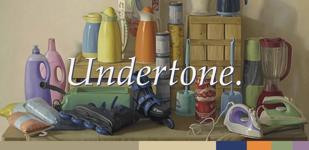
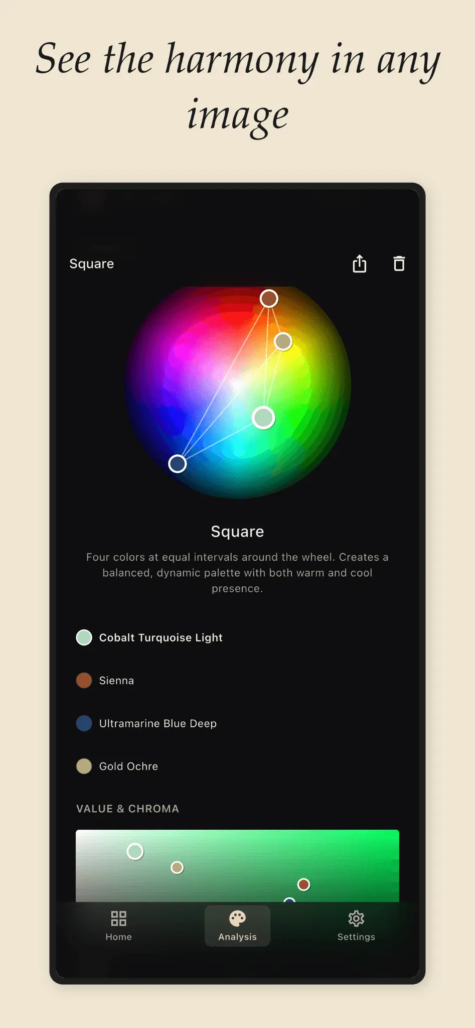
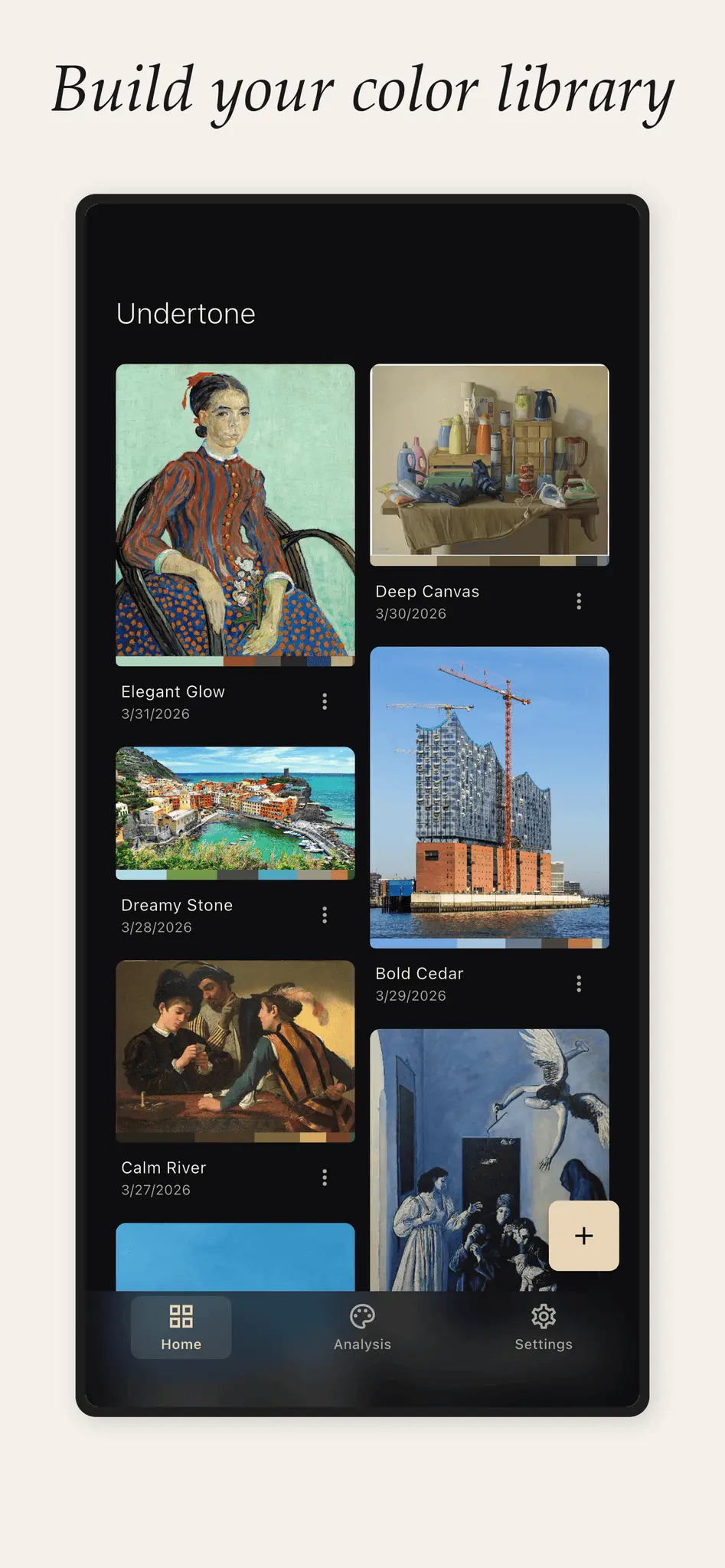
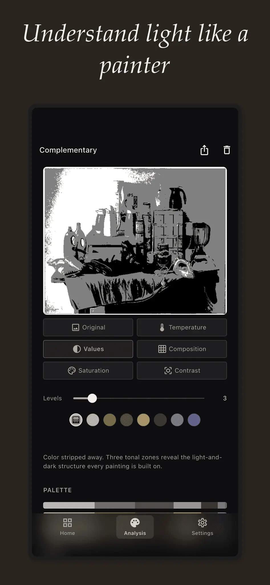
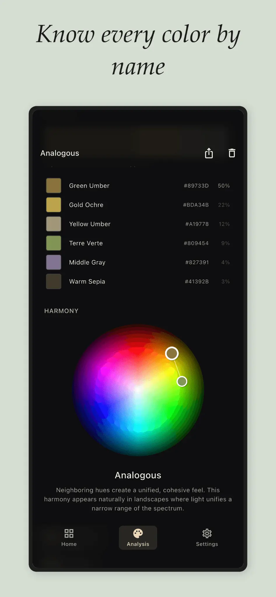
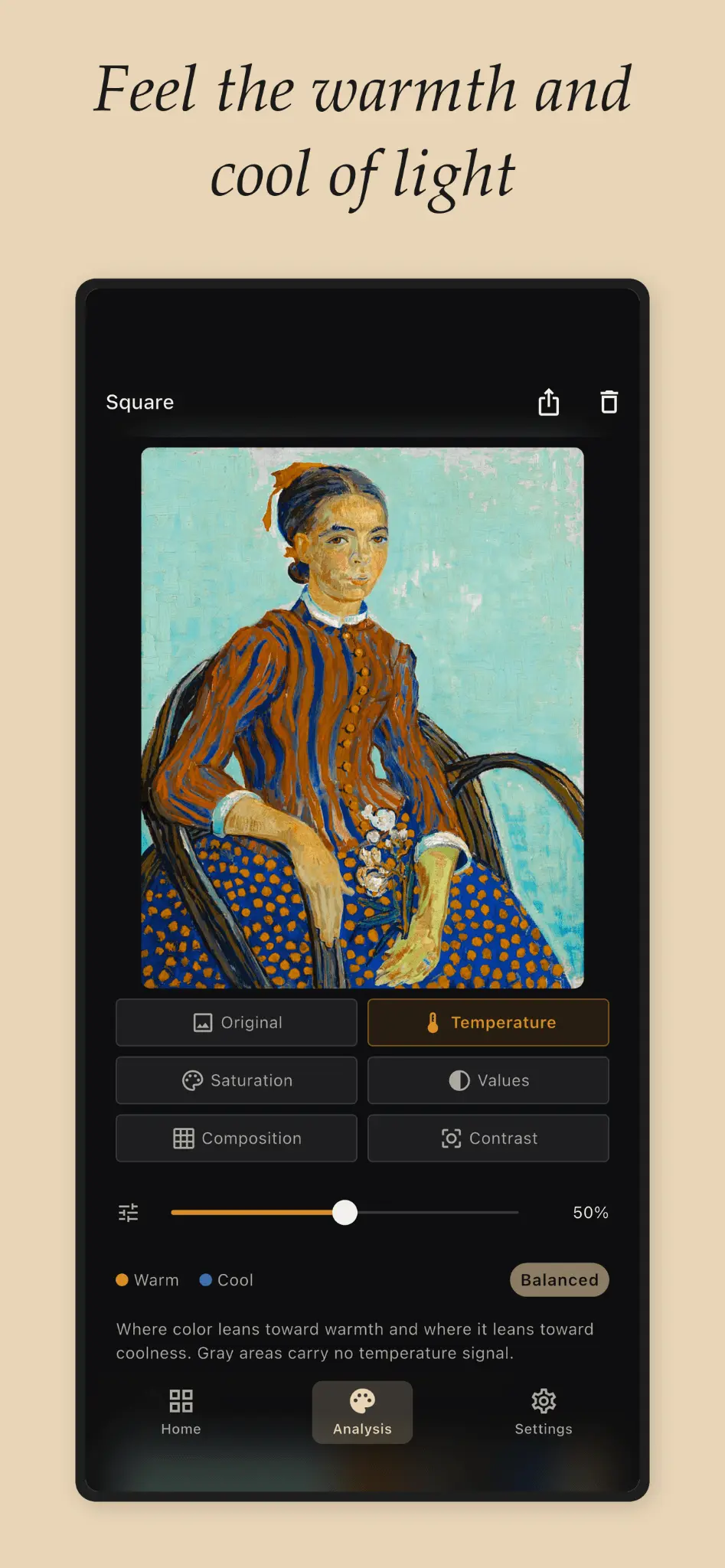
See Why Colors Work. Not Just Which Ones. Undertone points at any image, a photo, a painting, a screenshot, and shows the color structure underneath: palette with proportions, color harmony, a warm-cool temperature map, and value structure. For artists who want to understand color, not just pick it. Palette with proportions. Most palette tools hand you five flat swatches in equal rectangles. That is not a palette. Warm ochre at 60% of the image and a cool blue accent at 5% is a fundamentally different palette than a 50/50 split, even with the exact same two colors. Every color is labeled with a hex code and a painter-friendly name: Cadmium Yellow, Payne's Gray, not "Autumn Sunset Dream." Color harmony. Complementary, analogous, triadic, split-complementary, tetradic, square, monochromatic, or honestly, none, not every image has a clean harmony, and Undertone will not pretend. Colors are plotted on a wheel so the geometry is visible, not just claimed. Temperature map. A warm-cool overlay that makes the invisible visible. Muddy shadows are almost always warm paint leaking into the cools. Golden hour feels magical because warm light forces cool shadows by contrast. Toggle the map on, and the thing you could feel but not diagnose becomes obvious. Value structure. The image stripped to grayscale and divided into light, mid-tone, and dark zones, the way painters squint to see past color. A painting with strong values and wrong color still reads from across the room. Perfect color with weak values is mud. Built for painters mixing by trial and error who want to see why a reference painting's palette works before they touch the canvas. Photographers who nail an edit by feel sometimes and want to repeat it deliberately. Interior designers who need evidence, not "trust me," when they propose a color scheme. Game developers eyedropping references and wondering why their own scenes feel flat. "I've been painting for two years and I still couldn't explain why my teacher's palettes worked. I pointed Undertone at her reference and it just showed me: split-complementary, anchored in blue-violet, with a warm accent at maybe 8% of the image." — Sofia, oil painting student, Buenos Aires Every analysis saves automatically, building a personal color reference library. Runs on iPhone, iPad, Mac, and Android. All processing happens on-device, images never leave your phone, no account required. Free: unlimited analyses across Original, Temperature, Values, and Saturation modes, 20-image history. One-time purchase unlocks Premium: Composition (10 guide types), Contrast analysis, unlimited history, full-resolution export. No subscription.
Screenshots
Reviews (0)

Comments (1)
Launching Undertone: see the color structure behind any image, palette, harmony, temperature, value, all analyzed on-device. Built to stop guessing why a color scheme works.