
GoAchievo
GoAchievo - Reach In Public. One timeline for your goal.
Details
- Follow on
- @damir_mahamLinkedIn
- Categories
- Social Media & Influencer Tools
- Target Audience
- Indie HackersSolopreneursFounders & CEOs
- Platforms
- Web
About GoAchievo
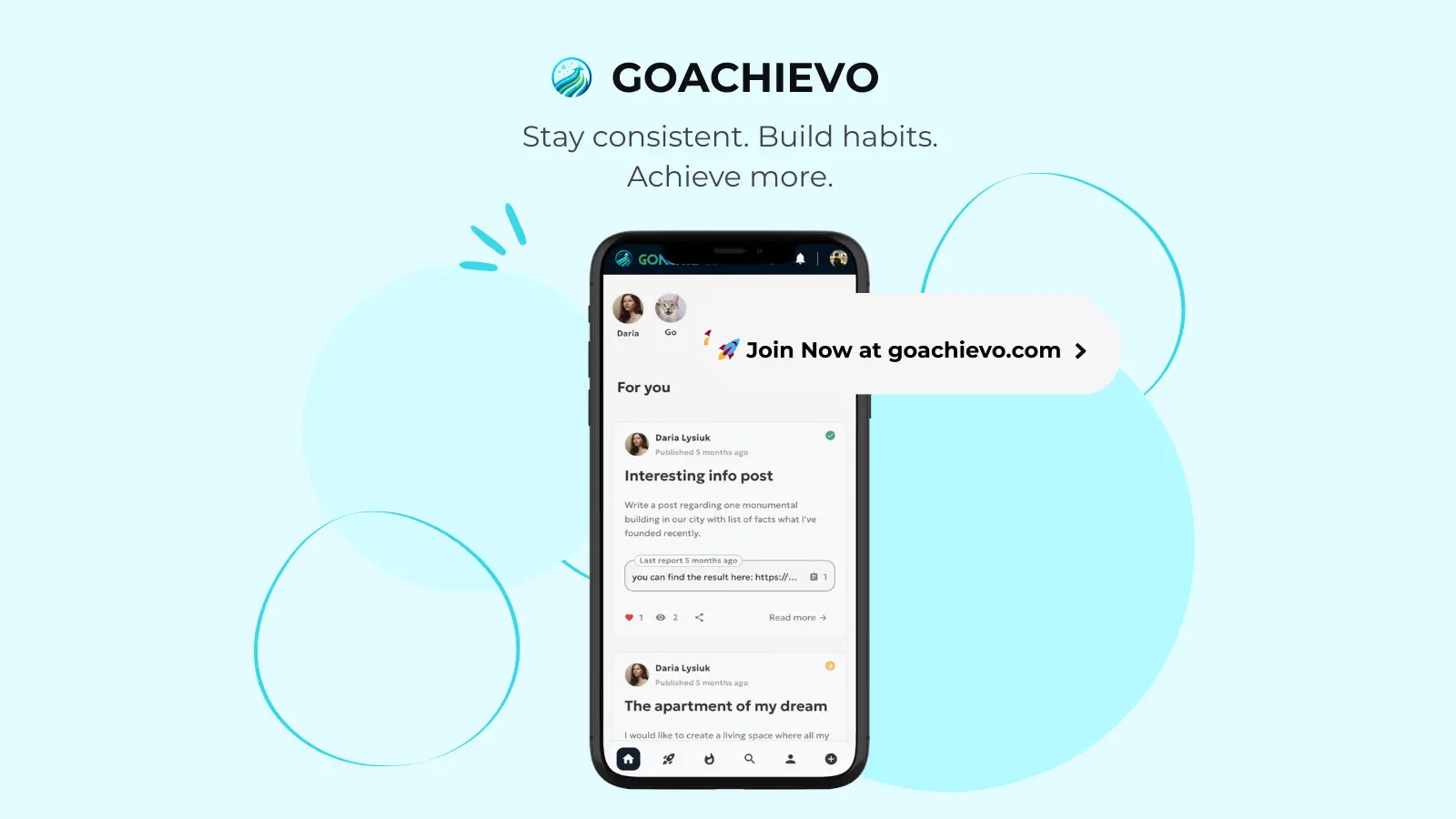
GoAchievo is built around a simple idea: Reach In Public. Instead of posting random updates that disappear in a noisy feed, you build your goal in one place and share progress step by step - clearly and consistently. Each goal has one timeline that keeps your entire journey together: - your updates - your wins - your streak - your progress story So it’s easy to stay accountable, and easy for others to follow and support you. One place for your journey to a goal. One timeline for your goal. Try it: goachievo.com
Screenshots
Product Updates (8)
🚀 Just shipped a major landing page upgrade for GoAchievo
I have been working on improving GoAchievo’s discoverability and onboarding experience - and just rolled out a big content + SEO update: ✅ Added structured pages: /about, /faq, /use-cases ✅ Introduced detailed vertical pages under /use-cases/ (fitness, education, self-improvement, startup, creativity & art, travel) ✅ All pages are available in multiple languages (EN / UK / DE / NO) ✅ Implemented auto-generated sitemaps covering every locale + use case ✅ Added a burger menu for cleaner mobile navigation ✅ Improved internal linking between landing → use cases → product The goal: make it easier for new users to understand how GoAchievo fits their life, while giving search engines a clear, structured content map. This is part of my ongoing effort to build GoAchievo around "Reach in Public" - one place to track goals, share progress, and keep everything in a single timeline. Live here: 👉 https://goachievo.com/ Would love feedback - especially on the use-case pages and overall navigation 🙌
Comments (0)
No comments yet. Be the first to share your thoughts!
Shipped: themes + WCAG accessibility upgrades + SEO improvements for my landing page
Quick update on my project (GoAchievo) - I spent this week improving the foundation of the landing page instead of adding new features. ✅ What I shipped: - Added themes (cleaner visual consistency across the landing page) - Enhanced accessibility based on WCAG (better contrast, focus states, keyboard navigation, etc.) - Moved the landing page to the root path / (instead of being under a separate route) - Improved SEO (metadata, structure, better indexing setup) It’s not the most exciting update, but it makes the product feel more professional and easier to trust. Next step: I want to polish the “first impression” even more and start sharing more real screenshots from the app. If you’re working on a landing page too - what gave you the biggest SEO win early on?
Comments (0)
No comments yet. Be the first to share your thoughts!
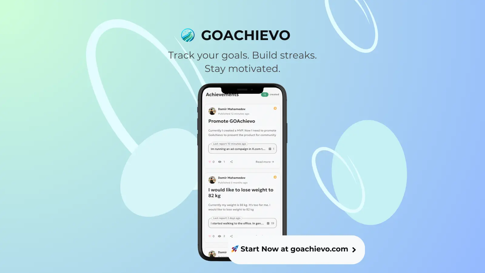
Building GoAchievo: new Feed redesign + swipeable pictures inside posts
I just finished a redesign of the Feed page for my side project GoAchievo. My main goal was to make the feed feel like a timeline of real progress — short updates linked to achievements - instead of a noisy social feed where everything disappears. What changed ✅ Cleaner Feed layout (more focus on the report/update text) ✅ Achievement context is clearer (so posts feel connected to a goal, not random) ✅ Added a swipeable image gallery (swiper) inside posts (great for progress screenshots) ✅ Better meta info (time, likes, comments) + a simple “Read more” action I’m trying to keep everything minimal and fast, but still motivational. If you have 30 seconds, I’d love feedback: - Does this layout look clear and “progress-first”? - Would you engage with updates like this (like/comment), or is it still too passive? - What would you add/remove to make it feel more addictive in a good way? Discover: https://goachievo.com/launch/ Thanks! 🙌
Comments (0)
No comments yet. Be the first to share your thoughts!
Working on a /feed redesign for my goal-tracking app GoAchievo (WIP, not in prod yet).
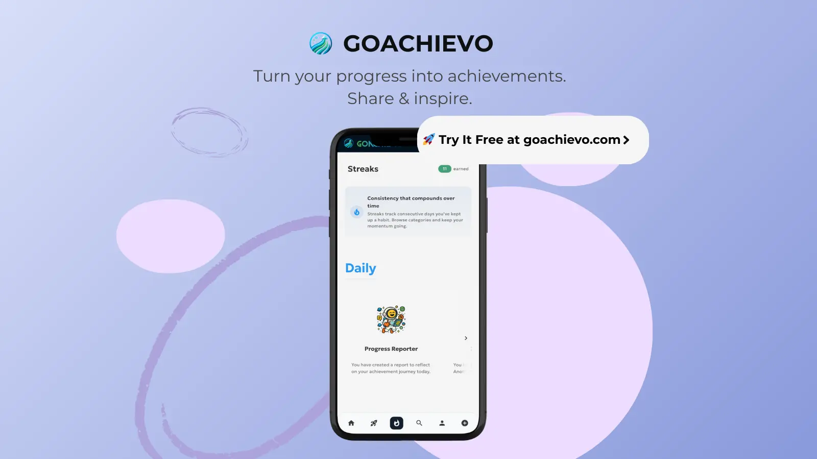
Current idea: the feed should show wins (reports) instead of generic achievement posts. So each feed item becomes: - report text (the actual progress update) - likes + comments - linked achievement below - “Read more” to open details If an achievement has no report, it won’t appear in the feed - I want the feed to feel like real momentum, not empty cards. Would you hide “empty achievements” too, or still show them for visibility?
Comments (0)
No comments yet. Be the first to share your thoughts!
I redesigned the GoAchievo landing page - does it explain the product in 3 seconds?
I have just fully redesigned the GoAchievo landing page. This is not just a visual refresh. It’s more like a small A/B test in public. My main question was simple but hard: 👉 Can a new visitor understand in ~3 seconds what GoAchievo is and why they might need it? I realized that before, the idea was not clear enough. GoAchievo is built around one core belief: "Reach in public." Sharing your progress publicly is one of the strongest ways to stay consistent. But then comes the obvious question: "Why not just use Instagram, Reddit, or X?" That’s exactly why I redesigned the page. Social media is built for everything at once: – vacation photos – random thoughts – memes – life updates When you post about a goal there, it quickly gets buried. Your progress is scattered. Your story is lost. GoAchievo is different. It’s one dedicated place for your goals and daily steps: - all updates live in your achievements - people can easily follow your full journey - others can support you and give boosts - your progress stays visible and structured Now I'm trying to be very honest with myself: - Are these changes worth it? - Or was the old version actually better? If you want to see it yourself: 👉 https://goachievo.com/launch/ I’d really appreciate feedback - especially from a "first-time visitor" point of view. Does the new version explain what GoAchievo is and why it exists fast enough? Thanks 🙏
Comments (0)
No comments yet. Be the first to share your thoughts!
I made some changes to my landing page after feedback - would love your honest take
I have been iterating on GoAchievo’s landing page after getting feedback from early visitors. A few things I tried to clarify: - It’s free - no pricing page, no credit card, no tiers - The core idea is public daily check-ins to stay consistent, not another productivity dashboard I also added a real question someone asked me about pricing and my public reply, just to be transparent about why Im keeping it free while I focus on learning from users. I am still early and figuring this out, so I’d really appreciate honest feedback: - Do you understand what this is within the first 10 seconds? - Does anything feel confusing or unnecessary? - What would make you bounce immediately? Not looking for praise - critical feedback is way more helpful.
Comments (0)
No comments yet. Be the first to share your thoughts!
A missing meta description was quietly hurting my landing page SEO
I ran an SEO audit on my landing page and discovered a surprisingly critical issue: the meta description was missing. After reviewing the full report, I fixed the SEO by following the tool’s recommendations. It was a good reminder that even basic SEO mistakes can slip through and silently impact visibility. If you want to quickly sanity-check your own landing page, I used www.seoitis.com. It’s simple, but it helped me catch things I had overlooked.
Comments (0)
No comments yet. Be the first to share your thoughts!
I fixed the confusion on my landing page
I got early feedback that my landing page was confusing. Some people thought GoAchievo was: - a generic productivity tool - a native mobile app (because of phone screenshots) - or even a social network That was on me. So I reworked the first screen to make three things obvious in under 5 seconds: 1) It’s a web app, not a mobile app It now clearly says: works in your browser, mobile-friendly, no App Store needed. 2) What you actually do You don’t “post content.” You share a 1-3 minute daily check-in to keep a goal moving. 3) Why it’s public Not for attention, but for accountability and finding like-minded people working on similar goals. I also added a simple “Day 1” explanation: / create a goal → post one quick check-in → done / Small copy changes, but they completely change how the product is understood. This kind of feedback is uncomfortable - but extremely valuable. Shipping early and listening carefully beats guessing in isolation. If you’re building something, don’t optimize for clever wording. Optimize for clarity. Happy to hear more feedback.
Comments (0)
No comments yet. Be the first to share your thoughts!
Reviews (0)
No reviews yet. Be the first to rate this product!
Comments (1)
Really excited to launch GoAchievo. Staying consistent has always been the hardest part for me, so I built a tool that focuses on daily actions, not complex systems
Nice idea, I like the simplicity. Good luck!